
Interface design is a major aspect of digital products.
Buttons, cards, inputs, and check boxes are just some of the components that designers need to create usable, friendly, harmonic and intuitive screens for users.
In this article, you will learn more about Patagonian’s Design System, created by the company’s design team with Figma. We will show you the best practices and how we apply them.

What’s a Design System?
Design systems organize the decisions that designers need make so that they are scalable, understandable and consistent throughout a digital product.
So, a design system is essentially a library of reusable components guided by clear rules and brought together to build an infinite number of applications.
Advantages
Some of the benefits of having a design system include reducing time and risks, being consistent throughout all our components, and creating a shared language between design and development teams.
Design systems are more than a bunch of styles and components. As product designers, we need to document everything in detail so that our product can grow consistently.
When building a design system, we need to choose the foundations of what will later be the final product. To do that, we rely on visual, morphological, compositional, and even psychological criteria. These guidelines will allow us to define the typography, grid, color palette, strokes, shadows, and icons that best suit the product to be built.
The color palette
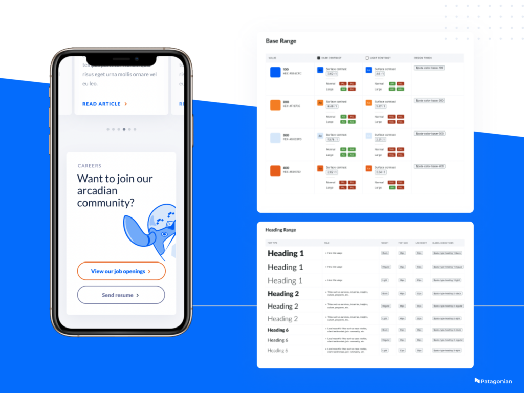
When choosing a color palette, we need take into account three large groups: base, neutral and feedback colors.
• Base colors influence the entire system. We will select one or more hues and apply them in the interactive components.
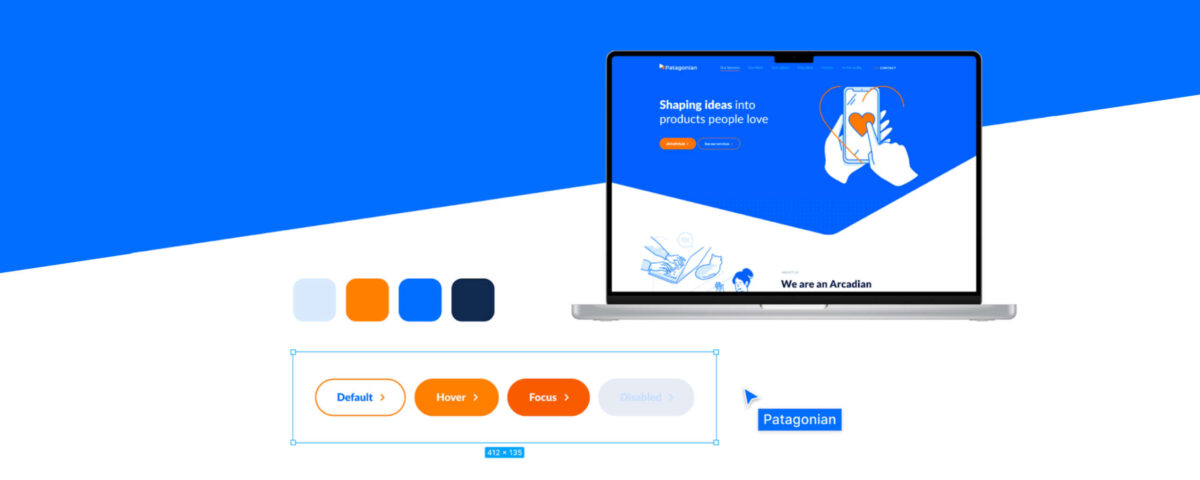
• The primary color will be used to capture users’ attention. We can design the different buttons and actions by applying lights and shadows to that hue.
• Accessibility. It is essential to always keep accessibility in mind when choosing the product palette and to document how each base color works against neutral colors in order to ensure contrast and legibility.
Type System
To set the type system, we use the 4px rule, which involves choosing a font designed for screens and creating a typographic system setting up headers, body texts, and button types.
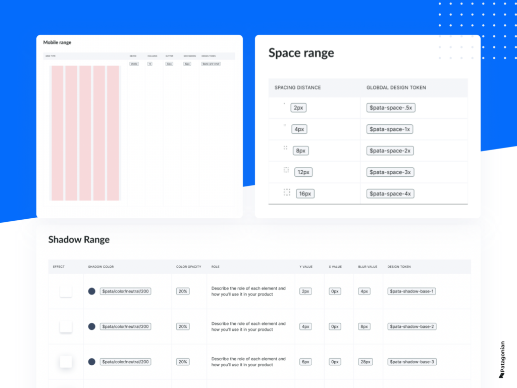
We use the same 4px rule to set up the grid system and spacing. This methodology ensures that the content of our interface follows a consistent spacing rule. By doing so, we generate visually pleasing designs with rhythm and harmony.
Taking into account technical criteria strictly linked to visual design, we document the foundations of the design system.
All these design decisions will be applied to the product components later on.
Design Tokens
It’s good practice to incorporate design tokens in this step of the process. They will provide multiple benefits to the product and the teams that work on it.
When working with design tokens, we effectively name these foundations to create a consistent language between code and design, as well as time efficiency and scalability.
Components, patterns, and libraries
Once these design decisions are encoded into tokens, we scale the system by creating components, patterns, and libraries.
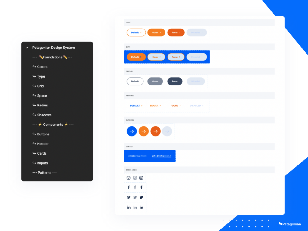
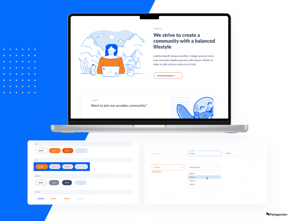
• Components are the interactive elements of the product, formed by the foundation. They can be buttons, inputs, check boxes, sliders, tabs, radio buttons, toggles, etc. It is important to document each state of those components like hovers, disabled, on click, etc.
• Patterns are more complex elements made up of components. They are usually solutions for specific tasks that users have to perform. They can be chats, forms, carrousels, etc.
• Finally, we document everything in libraries to navigate between foundations and components and help make the system scalable. The software we use, Figma, is a very powerful tool for documenting libraries and allows us to reuse components across different files and products.
Well-designed systems cascade, and any changes quickly impact the entire file. So, the digital product will have an associated document that will ensure high quality in the handover between design and code and will offerthe possibility of executing changes without compromising deadlines and scaling the product without limits.