
In this post, we will dive into the basics of SVG files and learn how to animate elements within them using CSS and SVG. We will focus on animating paths, which are a powerful and versatile element in SVG. Additionally, we will explore various JavaScript libraries that can assist in the animation process, making it easier and more efficient.
Whether you are new to SVG or an experienced developer looking to add some animation to your projects, this post will provide you with the knowledge and resources you need to get started.
SVG: Scalable Vector Graphics
Scalable Vector Graphics, also known as SVG, can be defined as a type of image created from XML or HTML code. Unlike other image formats, SVG image files are completely generated through code, so they can be edited or updated simply by altering it.
The SVG specification is an open standard developed by the World Wide Web Consortium (W3C) in 1999.
All major web browsers have had SVG rendering support for a while now.
But… Why SVG animations?
SVG image files have two main advantages over other image files:
- First, scaling the images is really easy because we are defining vectors, paths, shapes, etc. So, making them larger or smaller is trivial and will not blur the image in any way.
- Second, since this type of image file uses the XML format, integrating it into the HTML code and treating it as HTML, with all its implications, is pretty straightforward. For example, we can apply CSS code directly to the SVG nodes.
SVG Paths
The path element is the generic element used to define a shape. All the basic shapes can be created with a path element.
The element works by taking a sequence of drawing commands. It is a lot like the Logo programming language from 1967, but modernized and designed for fancy graphics. The element takes this sequence of drawing commands through the attribute d.
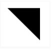
<!-- A right-angled triangle -->
<path d="M10 10 L75 10 L75 75 Z" />
The following commands are available for path data:
- M = moveto
- L = lineto
- H = horizontal lineto
- V = vertical lineto
- C = curveto
- S = smooth curveto
- Q = quadratic Bézier curve
- T = smooth quadratic Bézier curveto
- A = elliptical Arc
- Z = closepath
Note: All these commands can also be expressed with lower case. Capital letters mean absolutely positioned, and lower cases mean relatively positioned.
You can think of a virtual pen that draws on the screen, and the drawing comments in the path element merely control the pen. In the example above, the pen is being instructed to move to the position (10, 10) (M10 10), draw a line to (75, 10) (L75 10), draw a line to (75, 75) L75 75, and then close the path by returning to the starting point (Z). You can learn a lot more about the path element here.
Dasharray and dashoffset
For our first technique, we will use two SVG attributes: stroke-dasharray and stroke-dashoffset.
The stroke-dasharray attribute controls the pattern of dashes and gaps used to stroke the path. With SVG images being a part of the web browser’s DOM and stroke-dasharray being a presentation element, the attribute can also be set using CSS.
Similarly, the stroke-dashoffset attribute (which specifies how far into the dash pattern the dash should start) can also be controlled using CSS.
These two SVG attributes, together, can be used to animate SVG paths using CSS animation properties, giving the viewer the illusion that the paths are being drawn gradually.
Take this quadratic Bézier curve, for example:
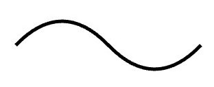
<path fill="transparent" stroke="#000000" stroke-width="5" d="M10 80 Q 77.5 10, 145 80 T 280 80" class="path"></path>To animate this path as if it was being drawn gradually and smoothly on the screen, we will have to set the dash (and gap) lengths, using the stroke-dasharray attribute, equal to the path length. This is so that the length of each dash and gap in the dashed curve is equal to the length of the entire path.
Next, we will set the dash offset to 0 using the stroke-dashoffset attribute. This will make the path appear on the screen as a solid curve (we are essentially looking at the first dash, and we already made each dash span the entire length of the curve). By setting the dash offset equal to the length of the curve, we will end up with an invisible curve (we are now looking at the curve being rendered as an entire gap—the part that immediately follows a dash).
Now, by animating the stroke-dashoffset property, you can make the curve appear on the screen gradually. (Rerun the pen to watch the animation).
See the Pen SVG Stroke animation by Juan Calou (@jcalou) on CodePen.
As you can see, the curve is always there. We are only changing the dash-offset to make the dashed part appear bit by bit.
You can take this a step further by using the same principle but with more paths:
See the Pen SVG 2 Strokes animation by Juan Calou (@jcalou) on CodePen.
Here you have one black curve that is fixed, a yellow one that is moving along the path, and another black one following the red one but 40px behind.
Stroke-dasharray and stroke-dashoffset are two very powerful attributes that can be used to apply animations and effects to your SVG paths. You can try this handy tool that you can use to experiment with the two attributes.
Animating Objects Along SVG Paths
Another cool thing you can do with SVG and CSS is animate objects or elements following a path.
There are two SVG attributes we are going to use for the animation:
- offset-path: The offset-path CSS property specifies the path where the element gets positioned.
- offset-distance: The offset-distance CSS property specifies a position along an offset-path.
By combining these two properties, you can come up with animations like this easily:
See the Pen Animating Objects Along SVG Paths by Juan Calou (@jcalou) on CodePen.
As you can see, we have a new element:
div.penguinThis element can be anything, a div, an image, text, or whatever. The idea in this example is that using offset-path and offset-distance, you can give the element a path to follow and animate the distance, and then the element will move through the path. In the second penguin, the stroke color matches the background (or it can also be transparent) so the effect is the penguin just following an “invisible” path.
SVG Animations Using JavaScript
Animating SVG elements with JavaScript can be much like animating DOM elements. However, with JavaScript, you can achieve the animation techniques we discussed above more easily.
There are a number of libraries at your disposal that can make SVG animations a lot easier than they already are:
- Snap.svg not only makes it easy to draw SVG images using JavaScript, but it also makes animating them as simple as calling .animate({}).
- anime.js lets you make a div element follow an SVG path with just a few lines of code.
- SVG.js has no dependencies and aims to be as small as possible while providing close to complete coverage of the SVG spec.
- Greensock and Greensock/drawsvg can be used to progressively reveal (or hide) the stroke of an SVG.
- If you are looking for a library that does more on its own but still renders stunning results, then Vivus is perfect for you. It takes a different, more configuration-driven approach to SVG path animation. With this library, you just have to add an ID to the SVG element you want to draw and define a Vivus object with that ID. Vivus will take care of the rest.
Further Reading
To go more in-depth with SVG animation, you can read this short article on the three ways to animate SVG images and watch the video screencast by CSS Tricks.
One thing this article didn’t cover is animating SVG images with Synchronized Multimedia Integration Language (SMIL). While using CSS for SVG gives you the advantage of working with something you are already familiar with, SMIL takes things to the next level. With SMIL, you can implement advanced animation effects such as shape morphing using SVG alone. A short, yet effective guide to using SMIL to that end is available here.
However, support for SMIL is not at 100% at the moment.
Conclusion
SVG is a powerful and efficient way to create sharp graphics that can adapt to any screen size, resolution, and zoom level. With the techniques discussed in this article, you will be able to create interactive and engaging experiences for your users that are lightweight and easy to implement.
SVG animation is a great way to enhance the user experience and deliver modern, vivid experiences while using standard web technologies. It’s an excellent tool to have in your developer toolkit, and I hope you found this article helpful and informative. Keep experimenting and have fun animating with SVG!