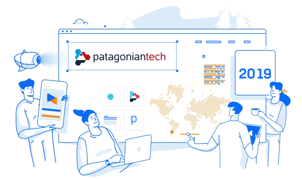
This is the story of how we decided to do something we had never done before: become our own clients; and how we did it to accompany the brand transformation process we were undergoing after being Patagonian Tech for eight years.
Besides being an entirely different company than the one we were back then, the strongest reason behind our metamorphosis was very simple: no one, ever, in our history, had called us Patagonian Tech. We were either Patagonian, Patagonia or the infamous Patagonia IT. But never Patagonian Tech. Why insist?
Also, we are now a bigger company, with a different structure, larger clients, a more diverse talent pool and, as always, deeply in touch with a healthy work-life balance, which is one of our defining traits. With technology at the centre of it all, of course. We love doing what we do and we want that to be reflected in our culture.
So, we set out on a journey of self-awareness and self-re-discovery until we arrived at a brand that better captured our escence. One that expressed who we were, but also what we do and where we are going.
Let us tell you how we did that.
Useful Data
Roles Involved:
- Product owner
- Communications lead
- Brand designer
- UX/UI Designer
- Front End Developer
- Back End Developer
- Full Stack Developer
Timeframe:
- Design thinking workshop (1 week)
- Proposal elaboration and presentation (2 weeks)
- Idea iteration (2 weeks)
- Application of brand to all the artifacts (3 weeks)
Result:
New brand and its applications, ranging from business cards and t-shirts to signage and social network profiles. New website.
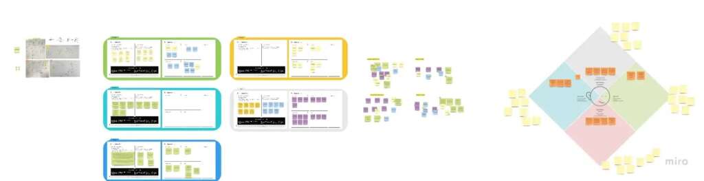
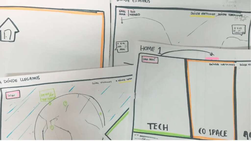
Design Thinking
Everyone chips in.
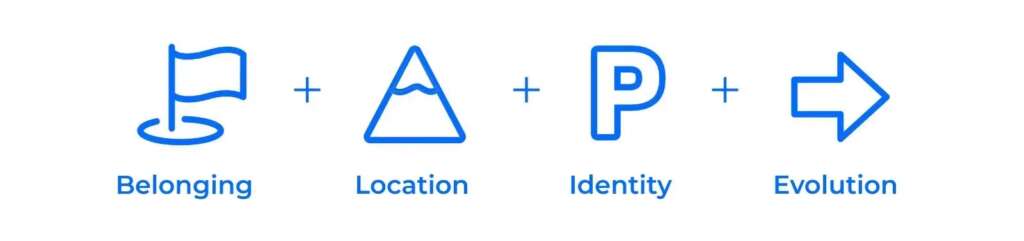
The process started with Design Thinking workshop-like sessions in which a purposely diverse group of Patagonian professionals pitched ideas around the company’s brand personality: What are the defining traits of our brand? What are its emotions? How about its relations?
It took three iterations with a team consisting of brand specialists, designers (both UX and UI), product people, random Patagonians and even board members to come up with mockups for the first concepts. After a thorough selection process we arrived at the target brand description.
The resulting synthesis was an essential input for the remainder of the project. It was used for everything from choosing the colour palette to the website redesign.
Conceptual design
You are here.
Research. Research. Research. A key aspect of a rebranding process is to study the current brand and find its pain points: Where does it not represent us? What are its shortcomings?
Patagonian is not just a tech company: we create products, we shape them conceptually, fine tune their essence and only then we develop them. In other words: we are there throughout their entire lifecycle. From conception to birth to growth to — sometimes — defunction.
Our company’s roots are also deeply tied to nature. We have established our headquarters in the Alto Valle and Andes regions in Argentina’s Patagonia for strategic reasons, but also as the result of our sentimental attachment to the area and the possibilities it offers in terms of work-life balance.
All these aspects had to be taken into account within the visual system.
Illustrations were the perfect resource to integrate all these elements and have them coexist in the brand. They also add other positive attributes to the identity: they humanize and create empathic connections; they are reusable; and easily portable to multiple implementations in different platforms.
The Color Palettes
Color your emotions.
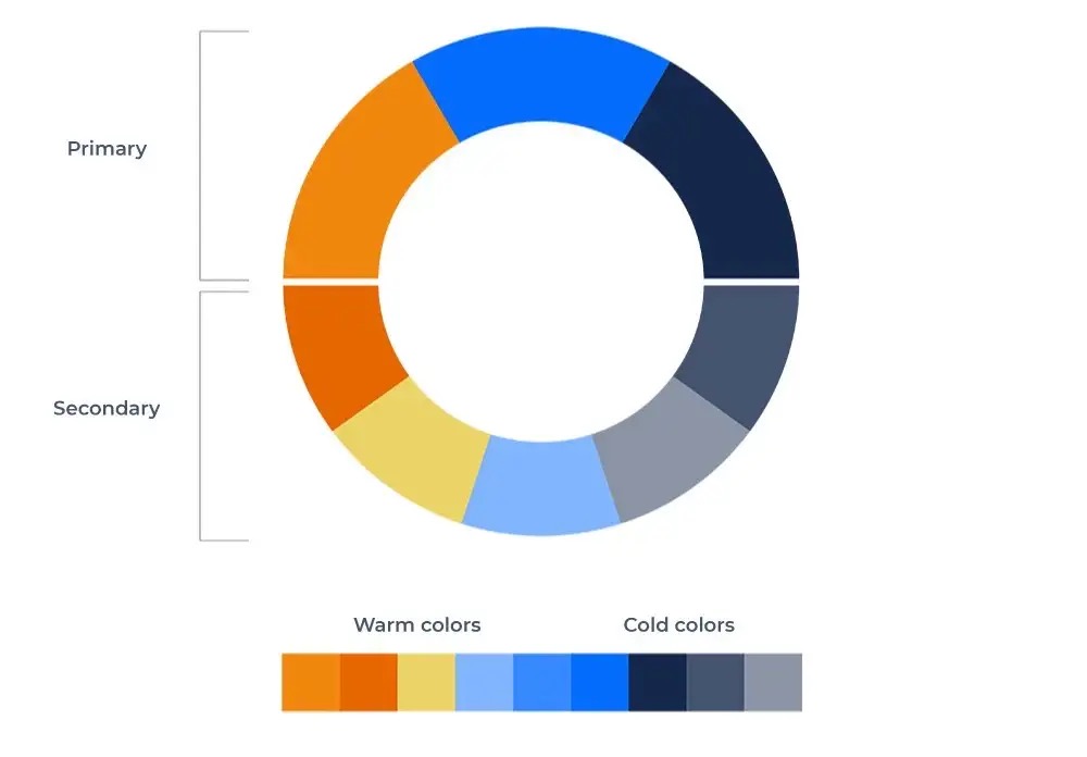
It is a scientific fact that colors influence people’s emotions. With that in mind, plus the need to represent our Patagonic roots, and, of course, our collective preferences; we picked our colour palette.
As a result of our workshops we chose orange in order to represent Patagonia’s natural environment and blue to transmit calmness, transparence and honesty, some of our company’s core values. Also, to help drive a more luminescent and bright image we added white.
That’s how we arrived at the primary colors in our palette.
Secondary colors were defined to alternate in other applications of the brand such as corporate presentations and other documents. The goal is to not abuse primary colors while maintaining a chromatic balance in all corporate materials.
Naming
Simpler is better.
As mentioned earlier a key decision was the renaming. Besides the aforementioned avoidance of the word Tech on behalf of basically everyone, we wanted to accompany the message of being not just a Tech outfit, but also end to end product crafters.
So… goodbye “Tech”!
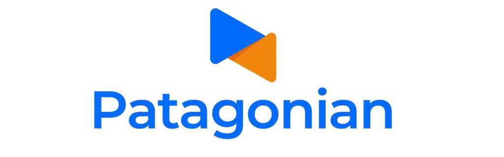
Hello ‘Patagonian’.
Simpler is better.
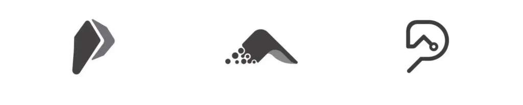
We loved the resulting icon + logotype combination:
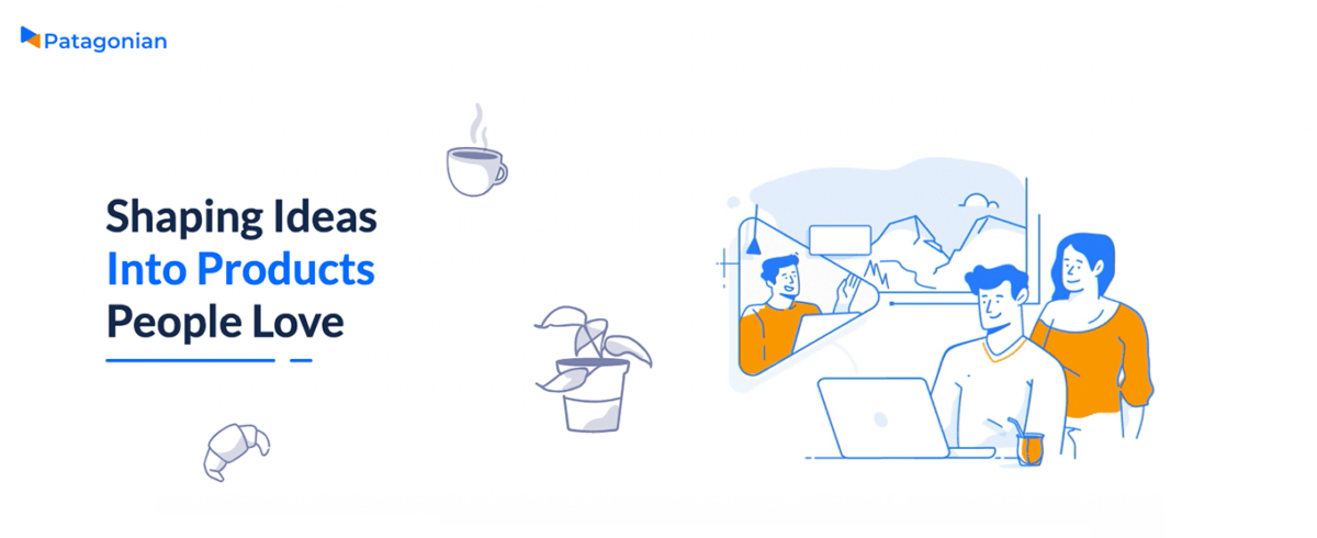
New brand, new website
Welcome to our new home
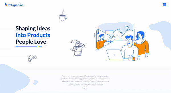
Of course, once we had our brand new brand (!) we had to re-do our website.
Over the course of the last few years a lot had happened that reshaped Patagonian: over 200 projects for more than 50 clients in 15+ different countries; a bigger team (and the need for an even bigger one), new offices, new customers, new partners, etc. It all had to be represented in our new site, in a language in sync with our new identity.
Three taglines were devised for the site homepage that were to be animated with illustrations and the company’s new logo. We redefined our service lines and added a map to showcase clients, offices, and other relevant geographical landmarks; we also added links to our regional initiatives such as Patagonian Academy and Patagonian Conf; and a host of other content.
Best that you check it out yourselves: patagonian.com
Better Conversations
We are social creatures
As a final step in the process, our social media channels had to be adapted. This task goes beyond a simple reskinning. It involves analyzing each platform with its nuances — its specific formats, codes, etc. — in order to come up with the appropriate brand adaptation.
So we came up with individual reskins that maintain the core concept — its novelty and its freshness -, each using the specific tools and possibilities of its respective platform.
Check out our freshly skinned media profiles at Facebook, Instagram, Linkedin and Twitter.